
ANZ Internal agency showreel
I directed an internal showreel to capture the breadth of the agency’s work and reflect what creative leadership looks like from within the business.
Every project featured passed through my hands, from early research and concept development through to final delivery across social, OOH, and integrated campaigns. The film brings together a diverse body of work into a single, cohesive narrative that showcases both craft and capability.
Ideation | Creative Direction | Mutli-channel roll out
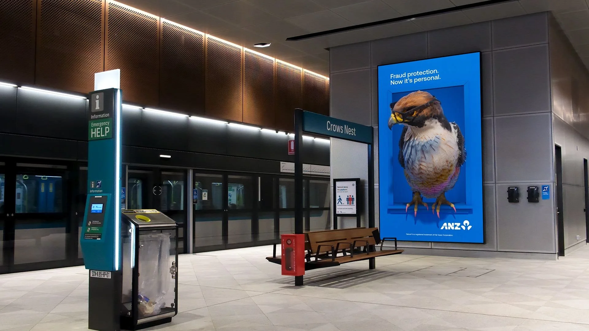
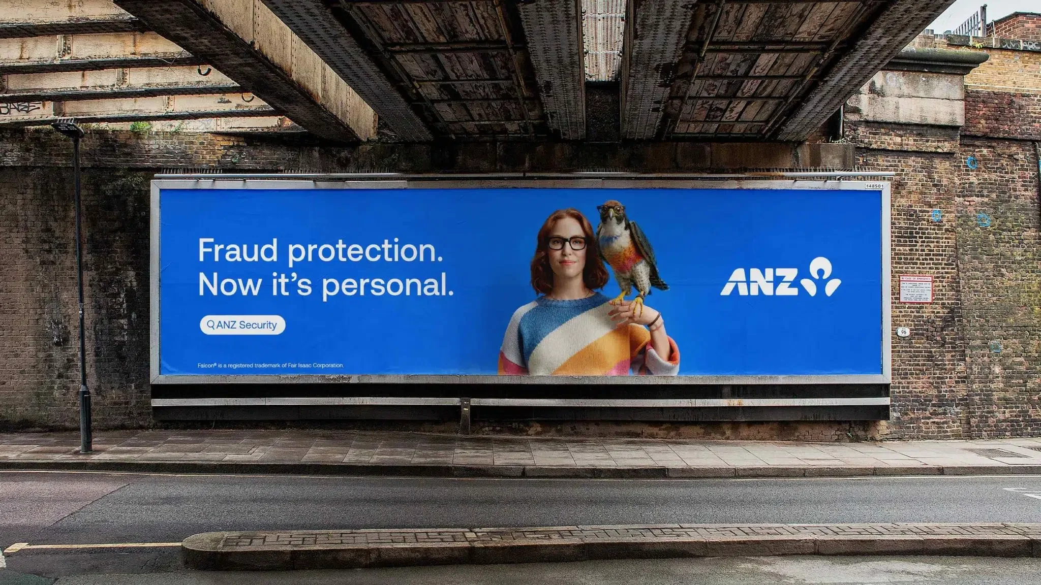
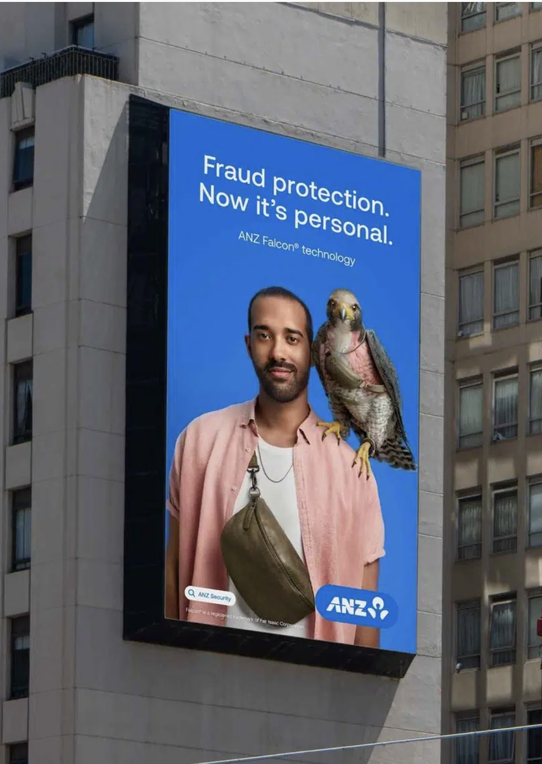
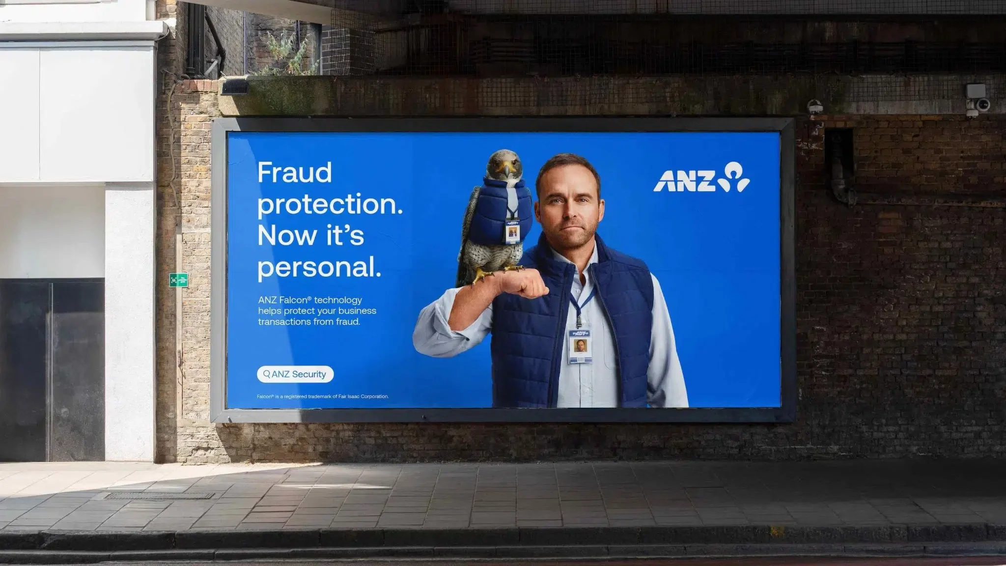
Falcon Campaign — Internal Creative Lead
ANZ engaged an external agency to develop the campaign concept; the challenge was to translate it into a coherent and consistent experience at scale.
I led the creative direction of the 3D Falcon asset and oversaw its rollout across a wide range of touchpoints, including digital, retail, social, and motion. By applying a clear quality framework, I ensured the idea held its integrity as it moved across channels and formats.
A complex campaign system, unified through consistent creative direction.


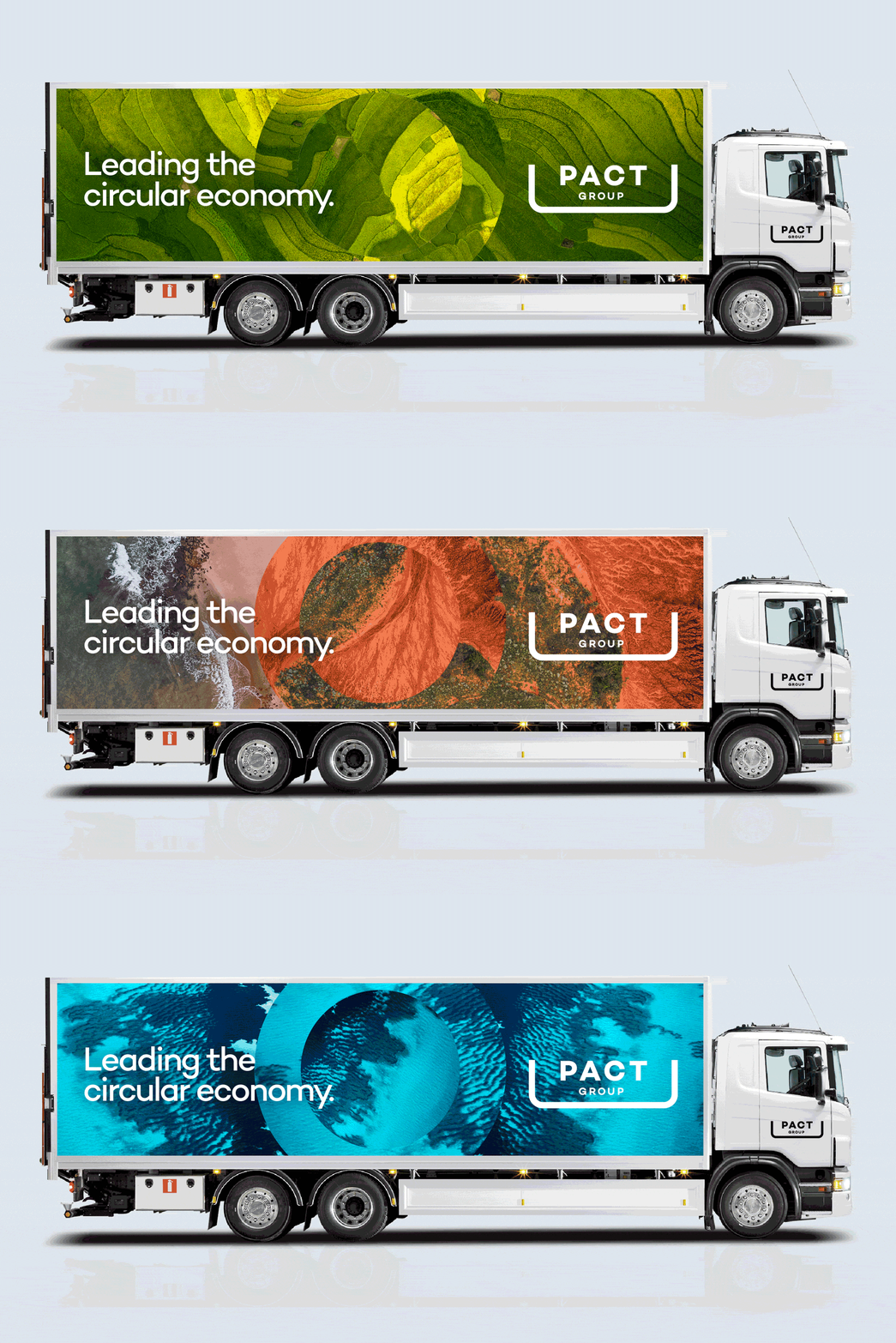

PACT is an organisation focused on driving sustainable packaging solutions and advancing circular economy practices across industry.
The challenge was to communicate a complex, system-level problem involving sustainability, waste, and circularity in a way that felt clear, actionable, and engaging, without losing credibility.
I shaped a brand identity and visual system that simplifies these complexities into a more accessible and cohesive narrative. By focusing on clarity, structure, and a more human tone, the identity makes technical and environmental initiatives easier to understand and engage with.
A brand that makes complex sustainability challenges feel clear, practical, and human.
Brand positioning & Identity | Launch campaign | Art Direction


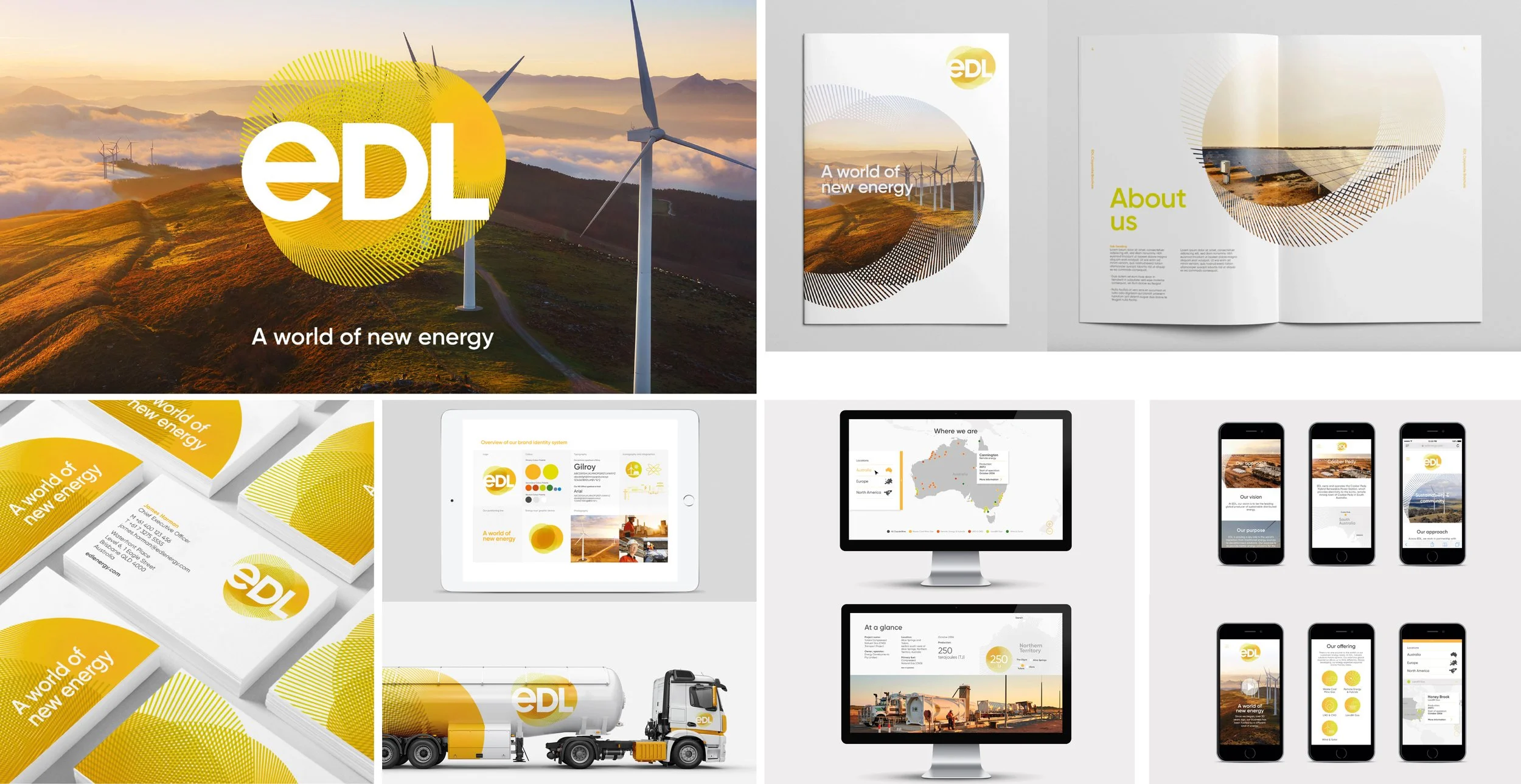
‘A world of new energy’
EDL is a global energy producer focused on delivering sustainable, off-grid and hybrid energy solutions in complex environments.
The challenge was to communicate technical expertise and large-scale infrastructure capability with clarity, while signalling a shift toward a more progressive, future-focused energy offering.
I led the development of a brand identity that balances engineering credibility with a more modern, adaptable expression. By simplifying how their capabilities are structured and communicated, the identity creates a clearer, more confident presence across diverse markets and applications.
An energy brand that feels both technically rigorous and future-focused.
Brand Positioning | Identity | UI Design | Digital and Print Assets | Motion Design | Art Direction of Brand Video
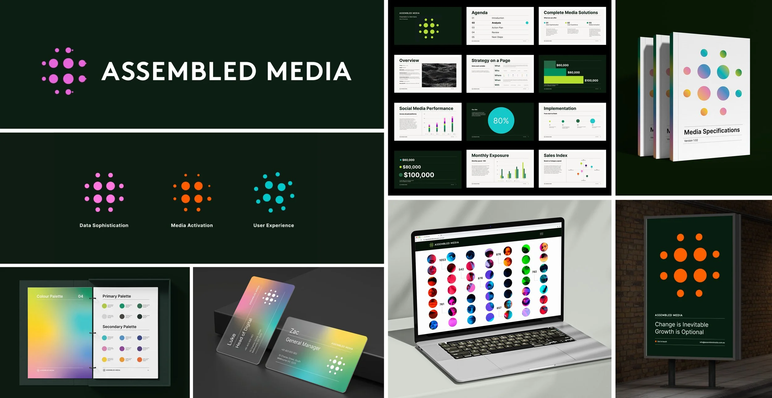
Assembled is a media agency with a strong focus on data and analytics, operating in a fast-paced, highly competitive market.
The challenge was to shift the brand away from dense, data-heavy communication toward something more engaging and expressive, without losing credibility.
I led the rebrand, developing a bold visual language and design system built around energy and clarity. Working closely with the data team, I reimagined how information is presented, introducing motion and interactive infographics to make complex insights more accessible and impactful.
A brand that transforms data into something engaging, confident, and easy to understand.
Brand Identity | Logo Animation | UI Design, UX Direction | Print and Digital Assets

The Green Boat is a workplace and property transformation consultancy working with major organisations to shape how people, space, and culture connect.
The challenge was to communicate a complex, multi-disciplinary offering with clarity, without losing the warmth and humanity that defines their approach.
I led the development of a cohesive brand system that unifies their disciplines into a clear, accessible narrative. By balancing strategic depth with a more human expression, the identity simplifies how their thinking is understood while maintaining credibility with senior audiences.
A brand that brings clarity to complexity, without losing its human edge.
Brand Identity | Pattern & Logo Animation | Website | Digital advertising | Social Media | Promotional merchandise
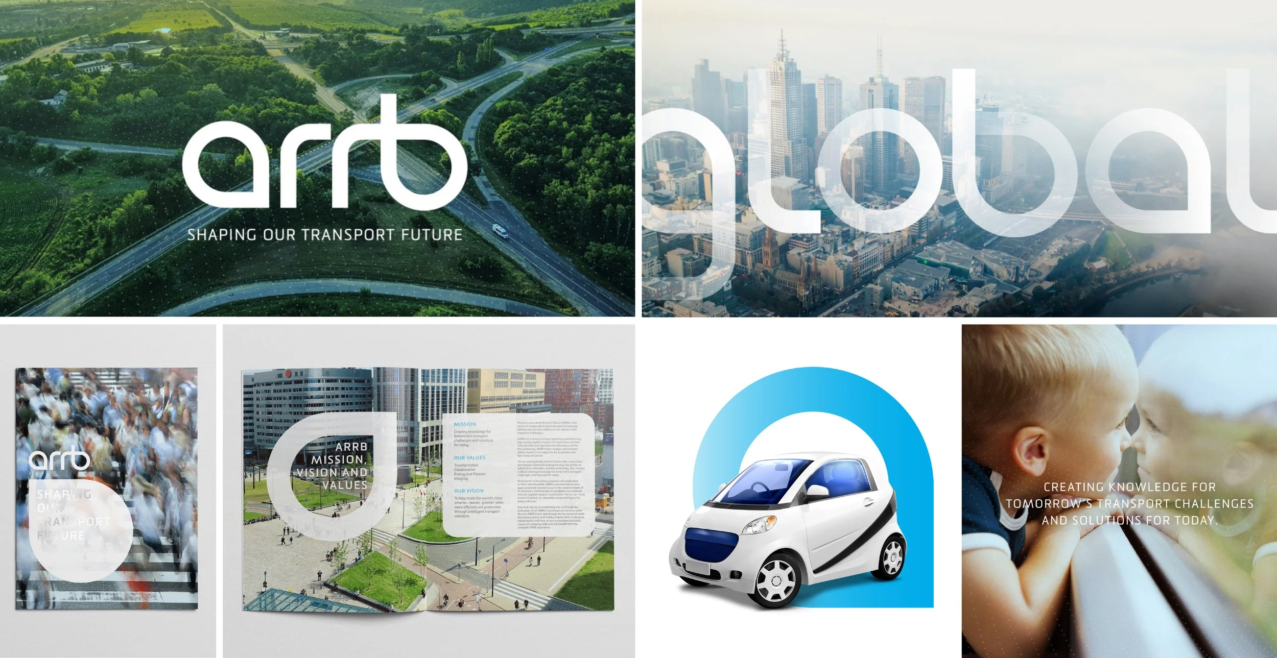
ARRB is an independent authority in transport research, advising government and industry on critical infrastructure and future mobility.
The challenge was to create a brand with the authority and credibility expected of an institution, while ensuring it remained open and approachable.
I developed a modern identity that balances institutional weight with clarity and accessibility. Inspired by movement and connection, the visual system reflects both the scale of ARRB’s impact and its role in shaping a more connected, forward-looking transport future.
An authoritative identity that remains open, human, and future-focused.
Brand Identity | Print Collateral | Digital Assets

Mocha Master Roasters is a family-run coffee business with a rich heritage and a growing presence in Australia’s specialty coffee market.
The challenge was to honour that heritage without falling into generic or overly nostalgic cues, while appealing to a more design-conscious, coffee-savvy audience.
I shaped an identity grounded in classic typography, rich colour, and refined detail, pushed just enough to feel current. The system reflects the brand’s authenticity and craft, while giving it the confidence to stand out in a highly considered category.
A heritage brand that feels enduring, not nostalgic.
Brand Identity | Packaging Design | Digital Assets & Content